Artistic Influences
In this essay I shall be exploring the works and influences of American Advertising Illustrator Alfred Charles Parker, better known as ‘Al Parker’ (1906-1985) [1] [2] and French, Paris based, Illustrator Ugo Gattoni (b.1987?) [3]. I chose to look at Al Parker because I admire the how he portrays characters and people in a way that produces a sense of story and narrative. Ugo Gattoni has an eye for detail in his work that also includes small intricate pieces of storytelling; the more you look the more there is to see which can create multiple narratives and ideas within one piece. Each of these illustrators has a range of influences from a mixture of artists, fellow illustrators and other sources outside of art.
Alfred Charles Parker
Direct Influences
Al Parker was educated in the Washington University School of Art in Missouri, and graduated in 1928. [2]
Al Parker is seen a great influencer himself, known to some as the ‘Dean of illustrators’ [2], as he was one of the illustrators that helped rejuvenate illustration in the mid-20th century as photography became more prevalent in magazines.[4]
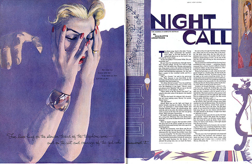
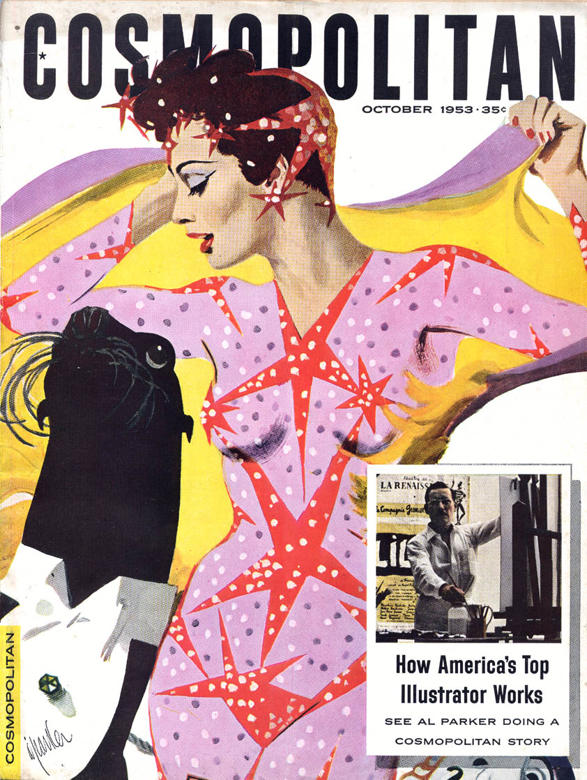
Ladies Home Journal – Al Parker – July 1958[7]
Parker’s work was often featured in fashion and ladies magazines, such as ‘Cosmopolitan’ and ’Good Housekeeping’,[3] and so his work was known to be largely influenced by, and also influencing of, the fashions of the time. His work also appealed strongly to women of the time as it reflected their ‘values and aspirations’ and were published to a large audience. [2]
Parker was a prevalent illustrator during the 1940s to 1950, during this time the fashion movement was known as the ‘New Look’ in Fashion and Parker’s work helped to set and lead these fashion trends. Women were ‘adopting them, copying their clothes…making them ‘part of the family’ ’.[2] [5]
Parker took his own photographs of people to work from, as well as often using his wife as a live model [6], and his final illustrations weren’t always too far removed from the original image, and so his fashion trends and insight may have been taken from these real women that he drew, despite not initially being a fashion illustrator or known for leading and influencing trends.
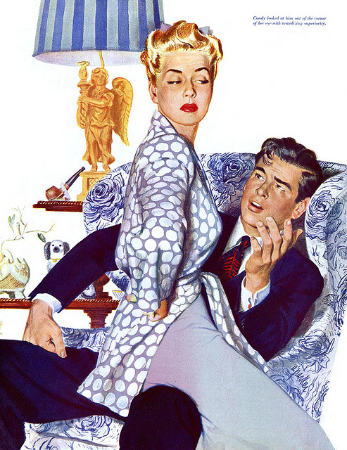
Publication unknown (Saturday Evening Post?) – Illustrated by Al Parker – 1943[8]
However, it seems clear and has been stated that his early influences hark back to illustrators of the ‘Golden Age’[9] such as Jessie Wilcox Smith(1863 – 1935)[10] and C. Coles Philips(1880 – 1927)[11]. These artists portray a sense of family and interaction that Parker picks up on and includes in his work although Parker’s pieces look more sexualised than some of Wilcox Smith’s work, which tend to be more innocent in nature, focusing mostly on children and mothers.
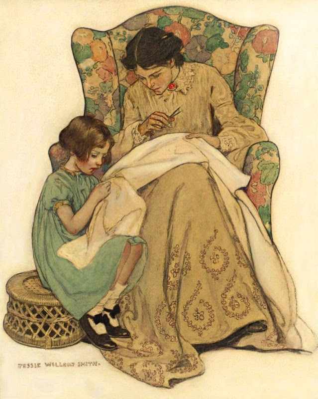
‘The Sewing Lesson’ – Jessie Wilcox Smith[9]
Al Parker often used his own photographs to compose an idea and work an illustration from it to create a more realistic look, this is often shown in the detailed faces and skin of his figures, which stand out from the not as obviously detailed fabrics and settings. Whereas, in Wilcox Smith’s works the figures tend to have a more consistent style and feel, no detail seems more exaggerated than another but the focus of the piece is still clear, even when there is a more detailed background than in the image chosen above. Wilcox Smith’s pieces tend to have more of a focus on the context and story of the image, whereas Parker’s work also has some focus on form and aesthetics.
In this instance Parker’s work shares a closer connection to that of C. Close Phillips who had occasionally taken a much more minimalistic approach to the form of his figures, such as his prolific ‘Fade-away Girls’ who were named as such because they would blend in with their surroundings, which was often a block colour[12]. Parker tends to develop a similar style to Phillips’ 1950s pieces, that use the suggested form of the figures through lines and block shapes and colours to give more focus to the form of the piece and suggest a simpler or more direct message while keeping the image of a figure or figures recognisable enough for it not to be abstract.
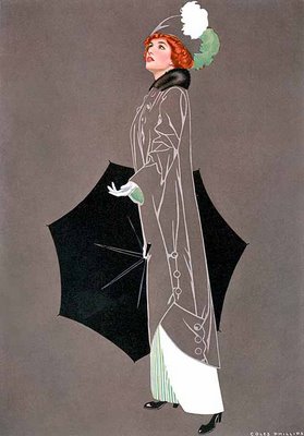
[Left] Coles Phillips Good Housekeeping Magazine cover (April 1913) “April Showers” Fadeaway girl [13]
[Right] Al Parker Cosmopolitan Illustrated by Al Parker September 1952[14]
Wider Influences
Looking a little further back into the world of advertising may also have provided influence for Parker’s, and the artists mentioned previously, work; from graphic designers and illustrators such as Henri de Toulouse-Lautrec and Jules Cheret.
Cheret in particular uses themes that are also seen in Parker’s work such as non-specific or detailed backgrounds to a focus figure.
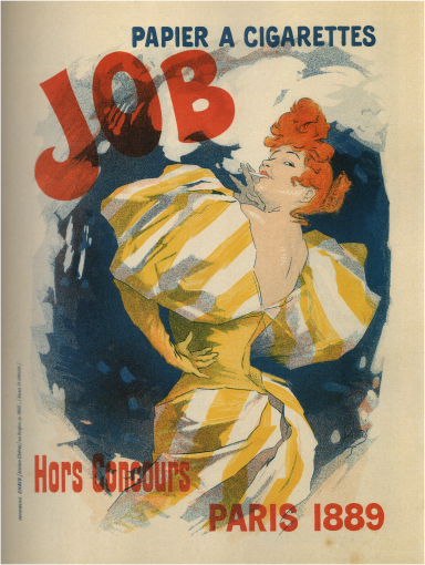
[Left] Jules Cheret JOB, PAPIER A CIGARETTES lithograph in colours, 1895[15]
[Right] Cosmopolitan magazine Illustrated by Al Parker October 1953[16]
There is a flirtatious nature to each of the women depicted in these works; each woman is not quite looking directly to camera, for example. There is also a similar sense of style and fashion, such as in the hair of each woman despite that the time difference between each piece is over half a century. The use of a few major colours is also a factor of each piece; however Parker’s work has more flexibility as he uses paints, of which the colours are generally easier to manipulate than lithography.
Although Jules Cheret claims to be mostly influenced by the paintings of Tiepolo [17]; there may have been other outside sources that may have influenced his work, and therefore Parker’s work. These other influences could include the ‘flat colour and stylized linear contours of’ [19] Japanese Woodblock prints. Although Cheret’s work does not have an obvious ‘flat colour’ style as mentioned, Parker’s has some flat forms and shapes in his work as well as a use of negative space. This could be a more indirect influence in his work.
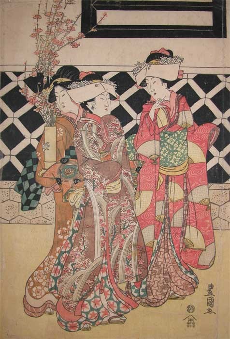
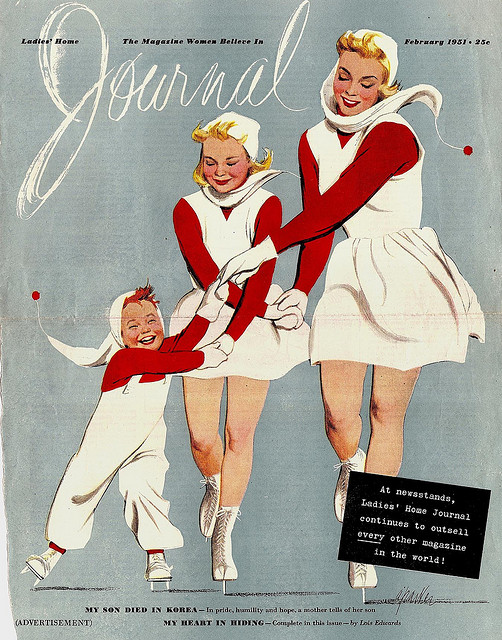
[Left] Toyokuni I Beautiful Women in Spring Kimonos with Peach Flowers 1798[20]
[Right] Ladies Home Journal Illustrated by Al Parker February 1951[21]
Although Parker’s pieces aren’t as always intricate in the detailing as the Japanese Woodcuts, there is a similarity in the outlining of forms and shapes within the fabrics worn by the figures. However, Parker’s figures often have a more expressive context or narrative as his characters are more expressive facially and in their body language. So while there is a little influence from these woodblock prints, it is not as direct or as obvious a connection to Parker’s work as artists such as Coles Phillips etc. who also share the more expressive narrative nature in their works.
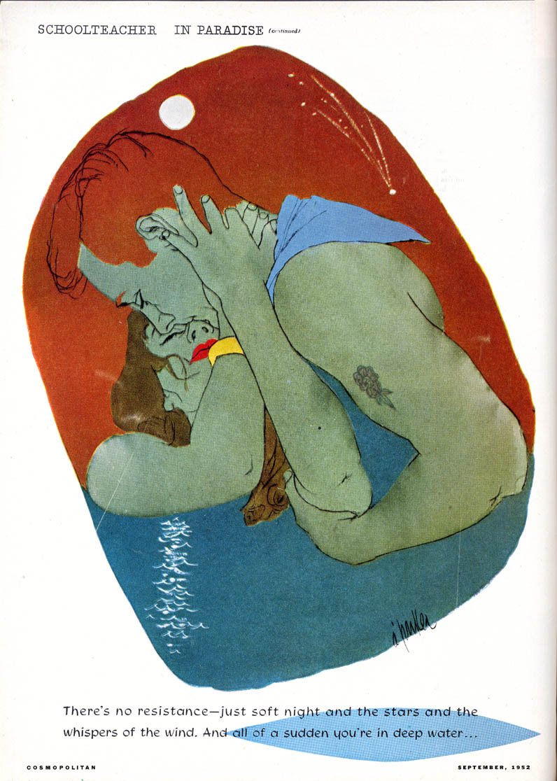
Henri de Toulouse-Lautrec’s posters also have a connection to Al Parker’s illustrations and may have also influenced the previously mentioned C. Close Phillips.
Some of Toulouse–Lautrec’s works also have a focus on form and simpler shapes similar to that of Philip’s work, and may have been an influence for his ‘fade-away girls’.
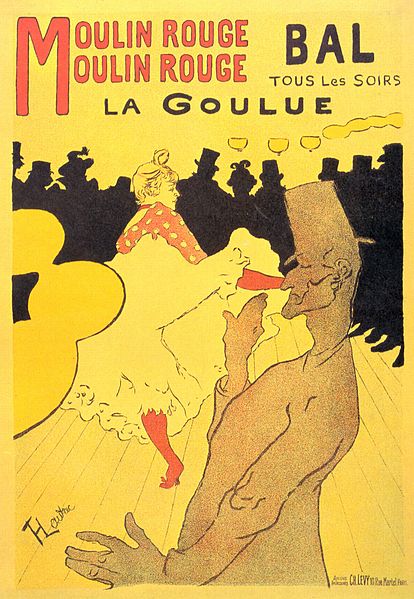
[Left] ‘Moulin Rouge: La Goulue’ – Henri de Toulouse-Lautrec 1891[22]
[Right] Cosmopolitan illustrated by Al Parker September 1952[23]
In these two pieces there are stark similarities, not just in the similar colour scheme. Although parker’s piece is probably closer in similarity to that of a ‘fade-away’ girl, the lines outlining the legs of the figure are used to also create Toulouse-Lautrec’s figures though his are more expressive in nature. Parker’s work, being based from photographs can be less expressive in the lines and mark making as he is recreating a more realistic context. Toulouse-Lautrec’s piece is more form based, although the figures are clearly human, there is an element of simplicity to the more ‘stylized abstractions of shapes’ [3]. This is seen in Parker’s work as the clothing on his figure, which is just a shape, but the surrounding detail leads us to suggest something else.
Ugo Gattoni
Direct Influences
Gattoni has worked in numerous commercial mediums as an illustrator, such as magazines, animation and books. A close friend of Gattoni is illustrator McBess; this could be because they have both worked for Nobrow press. [24][25]
They also have similarities in their work, and being friends, occasionally working on projects together, and this proximity may have influenced Gattoni and his work. [26]
I will mostly be looking at Gattoni’s large-scale pen and graphite landscapes.
[Top] McBess [Matthieu Bessudo] [27]
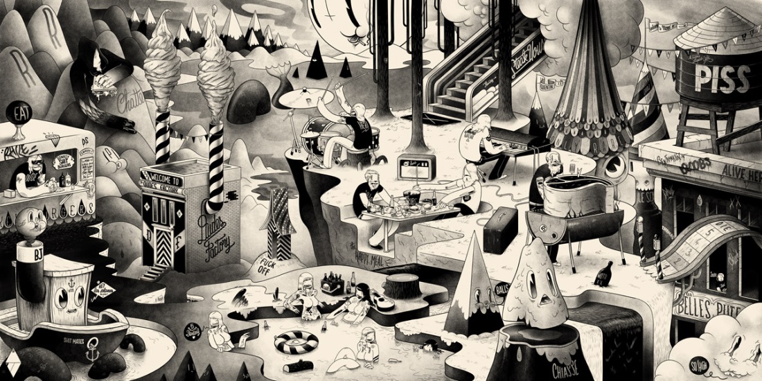
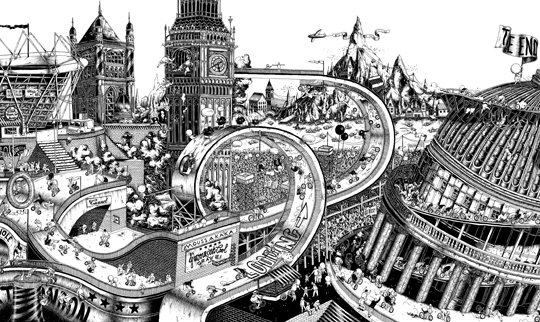
[Bottom] Section of ‘Bicycle’ booklet, Ugo Gattoni, 2012 [28]
There are clear similarities between these landscape works by McBess and Gattoni respectively, the dominant colours being black and white, most likely used to create a sense of nostalgia or ‘past’.
The landscapes are also quite fantastical and strange although Gattoni’s piece has more of a basis in reality as it is meant to be set in London for the 2012 Olympic Games [24] whereas McBess’ piece is more simple in terms of shape and form and is not obviously set or based in an originally existing place.
[Top] Ugo Gattoni [26]
[Bottom] McBess, 2013 [29]
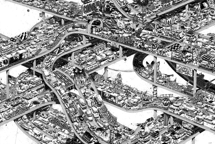
McBess has shown to have a more direct influence on one of Gattoni’s pieces with the large, hollow eyes which are a common feature of McBess’ work as well as working in black and white and traditional mediums. Although Gattoni’s piece has an element of cartoonish-ness, emphasised by the eyes, the form of the figure has a more three-dimensional and realistic feel. The use of a small house also shows Gattoni’s interest in drawing these cityscapes and an interest in ‘architecture’.[26]
These hollow cartoon eyes are likely to be influenced by cartoons by those such as the Fleischer brothers and Disney’s ‘Silly Symphonies’ in which this style of eye and use of bold black and white lines and shapes are used often. [30]
Ugo Gattoni, ‘Caravan Palace – Rock it for Me’ 2012 [31]
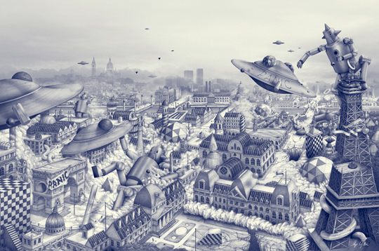
Gattoni has worked in part of an animation project for ‘Caravan Palace’ a band who write ‘electro-swing’ music.[32] This may have influenced his artwork in that ‘swing’ music was popularised in the 1930s-1940s [33] which gives a feel of an older time in which things in the media were still in black and white in some cases, such as television and again adds to the feeling of ‘nostalgia’ used in a lot of Gattoni’s work.
The ‘electro’ part of ‘electro-swing’ suggests ‘electronic music’ which the band uses to create this new sub-genre of music by using sampling etc. This gives the music a more ‘modern’ feel, which is seen in Gattoni’s work. Things such as UFOs, robots and strange geometric designs on buildings give an ‘other-worldly’ or ‘parallel universe’ feeling to the piece while having a basis within our reality by including recognisable buildings.

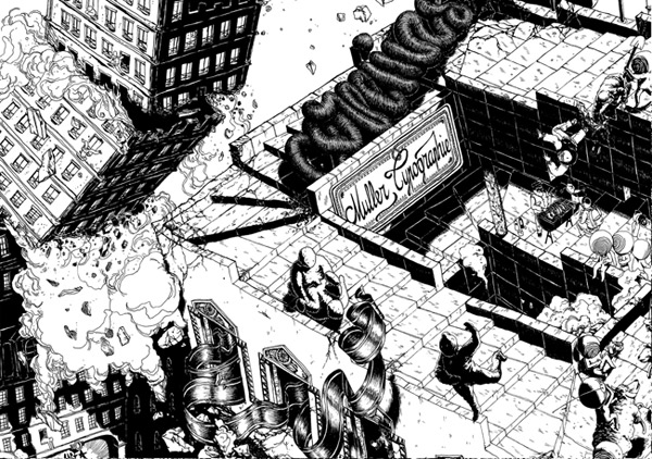
[Top] The ‘Gobbling Gluttons’, ‘Where’s Wally? The Fantastic Journey’ 1989, Martin Handford [34]
[Bottom] ‘The Folding Knife’ Ugo Gattoni, 2011 [35]
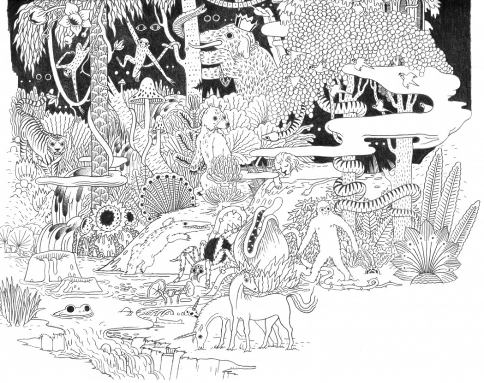
Gattoni claims have been influenced by the ‘Where’s Wally/Waldo?’ books illustrated by Martin Handford [36], and this is seen the most in Gattoni’s strange and detailed places and landscapes. Handford’s pieces have a more singular focus on the content being crowds of people, whereas Gattoni’s pieces have more of a range as there is no obvious theme or narrative in his pieces. Both pieces have lots of intricate detail that could be missed on a first look; however Gattoni uses more negative space to give an idea of what his work is showing, even from a distance.
The detail of each work gives a sense of a real place by giving the viewer a feeling of looking into a new world, or perhaps a new view of the world we live in already.
[Top] Micah Lidberg 2013 [37]
[Bottom] ‘Ultra Copains’ – 2010 – Ugo Gattoni [38]
A more current artist that Gattoni quotes some influence from is Micah Lidberg, another Nobrow contemporary [39], who has also produced works involving bizarre environments and places[40]. Although Lidberg does not work on such a large-scale as Gattoni, his work still shows detail but is more form based and simpler geometrically, closer to the work of McBess, whereas Gattoni’s work has more of a focus on content.
Lidberg’s work usually tends to have a lot of colour, but the stark black and whites of this particular piece may have been an influence on Gattoni’s work, which is predominantly black and white.
Surrealist painter Salvador Dali (1904-1989) has also been a large influence on Gattoni’s work, as he believes. [26]
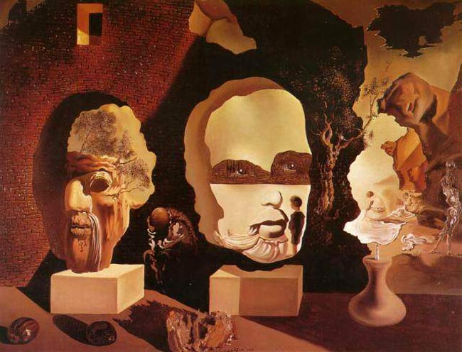
‘Old Age’ Salvador Dali 1940 [41]
Dali’s work is detailed and intricate as well as surreal and strange like Gattoni’s. Despite the strangeness of the work there is still an element of reality and recognisable things, much like Gattoni’s work, however there are more obvious double meanings and less plausible shapes and less of a straight-forward narrative. Gattoni’s work is more direct in its context whereas Dali enjoyed working with hidden meanings and messages. Dali uses form to create strange but familiar shapes in his surrealist paintings which may have influenced Gattoni’s use of geometric patterns and shapes in his work. Gattoni himself says that he enjoys using ‘geometry… and architecture’ [26] in his work.
This use of architecture may have been inspired by Hieronymus Bosch (1450 – 1516), who is said to be another influence of Gattoni’s.[26]
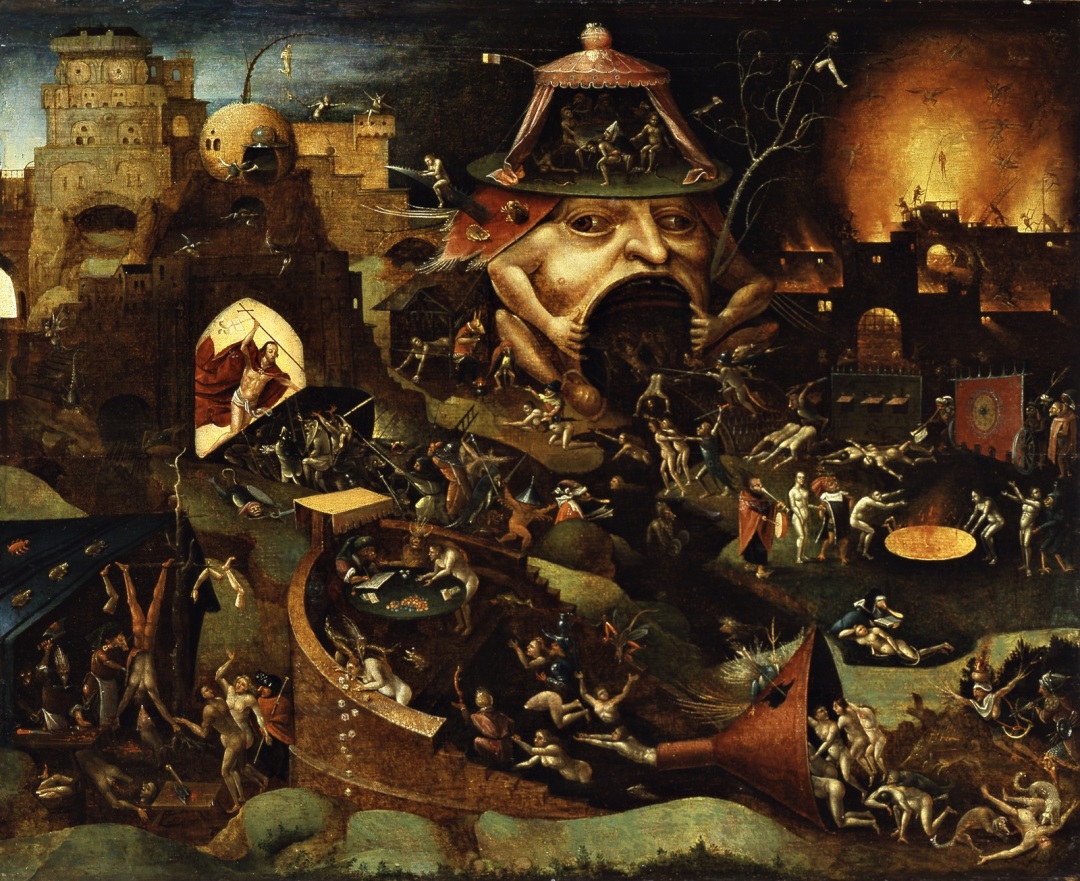
Hieronymus Bosch – ‘Christ in Limbo’ – 1575(?) [42]
While Bosch’s works are surreal and may have influenced that path in Dalis’ work, they also have elements of similarity to Gattoni’s works. The images presented in Bosch’s paintings seem more direct than Dali’s work, in which the strange images are hidden as other parts of the landscape or different objects. In Bosch’s pieces there are strange creatures and objects, but these are a constructed part of the ‘world’. Gattoni uses a similar mixture of obscure and recognisable buildings and objects to create a slightly bizarre place.
Bosch also works on a large-scale, which is also preferred by Gattoni, to be able to create the intricate details that make his ‘worlds’ more encompassing and impressive.
Speculative Influences
Handford’s ‘Where’s Wally’ work may have partially inspired Gattoni’s draw to large scale worlds and places, and while Handford himself doesn’t quote influence from them, there are various painters who created work of a similar nature.
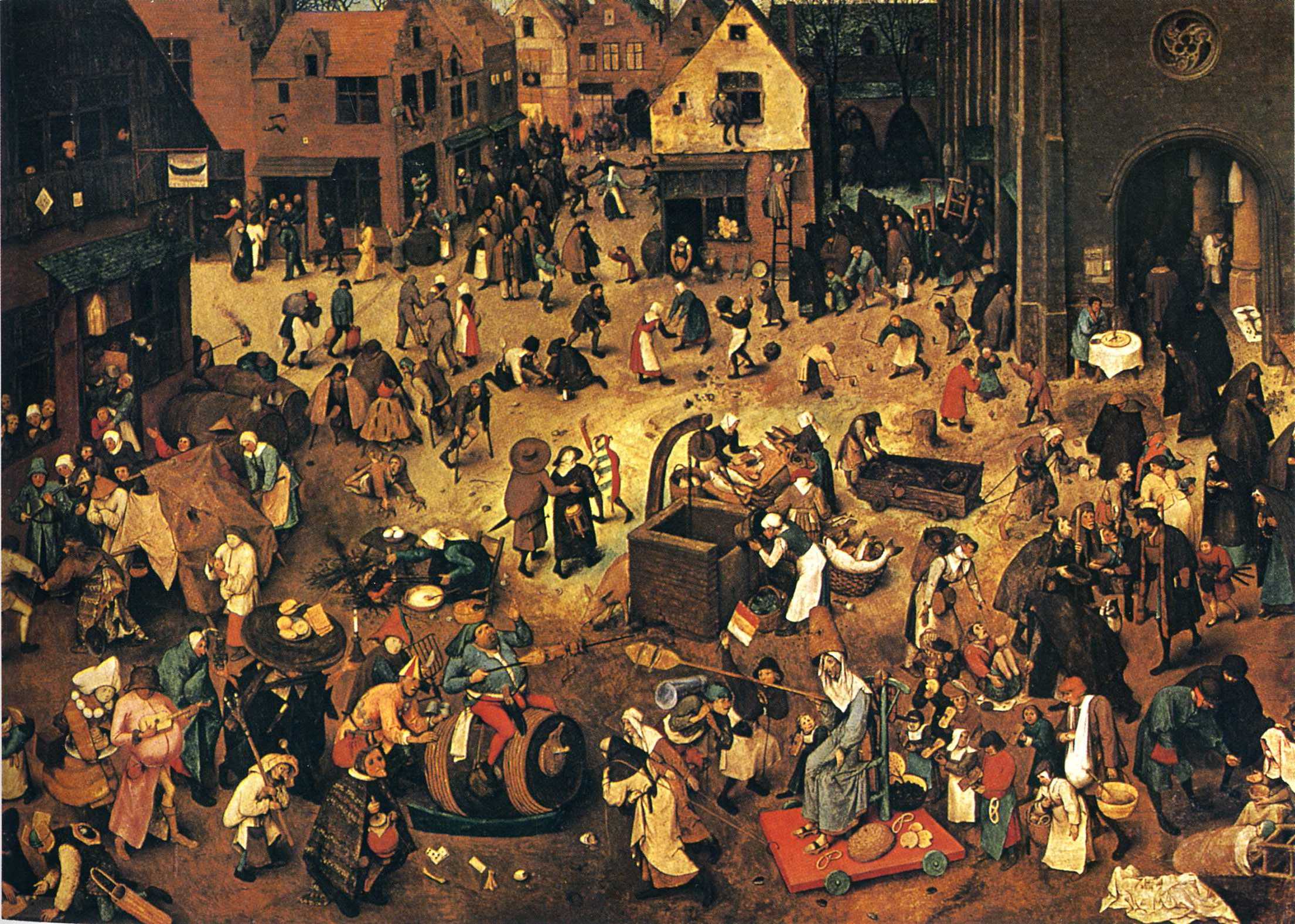
Pieter Bruegel the Elder ‘Fight between Carnival and Lent’ 1559 [43]
Bruegel’s piece is more realistic than any of Gattoni’s work, everything depicted in them seems correct for the era they were painted in, unlike Gattoni’s more fantastical works and figures which are more cartoon-ish in nature.
However, there is a sense of narrative and detail that is seen in Gattoni’s work, and a sense of fun that may have indirectly influenced Gattoni through Handford as Brugel’s work has been described as ‘16th Century versions of ‘Where’s Wally’’. [44]
This idea of depicting a large selection of life but in small details is something that has inspired Gattoni who enjoys creating and implementing the finer details of his worlds.
Conclusion
In conclusion I have learned that influences can stretch centuries into the past and still be relevant to contemporary artists as well as people who have used different techniques to create their art.
Parker had a range of similar influences around him from the fashions of the time, to previous illustrators of a similar position, however some of his wider influences may have been the inspiration for his character designs and use of form and aesthetics.
I learned that although Gattoni has a cartoonish style in his work, it can also be related back to 16th century painters as they also had large visions of places and worlds. Gattoni’s pieces also have influences in abstract ideas and architecture as well as other cartoonists.
Gattoni’s work also has a strong feeling of combining new ideas with older influences, as can be seen in his use of nostalgia and choice of influences.
References
1- Giambarba, P. & F. ‘Even More Great Al Parker Illos’, Blog http://giam.typepad.com/100_years_of_illustration/2006/11/al_parkers_grea.html
2- Kanzenberg C., Van Ness V. & Cherin M. ‘Al Parker Collection, 1933-1985’, Article http://www.nrm.org/finding-aid/alparkeread/Al_Parker.pdf
3- ‘Ugo Gattoni’, Blog Article http://artists.sergeantpaper.com/ugo-gattoni/
4- Parker C. ‘Al Parker’, Blog http://www.linesandcolors.com/2007/03/11/al-parker/
5- ‘1940s and 1950s Fashion History’, Blog Article http://www.unique-vintage.com/unique-vintage-style-guide-19401950s-clothing-i-6.html
6- Lacerte S. ‘Double Exposure: Al Parker’s Illustrations, From Model to Magazine’, Blog Article and Image Gallery http://library.wustl.edu/units/spec/MGHL/resources/overlays/doubleexposure.html
7- Peng L. ‘Parker 88’ Image http://www.flickr.com/photos/leifpeng/521252612/in/set-1502340/
8- Peng L. ‘Parker 86’ Image http://www.flickr.com/photos/leifpeng/517191910/in/set-1502340
9- ‘Artists by Movement: The Golden Age of Illustration’, Blog http://www.artcyclopedia.com/history/golden-age.html
10- Sotheby’s ‘American Paintings’, Jessie Wilcox Smith Image http://www.invaluable.com/auction-lot/jessie-willcox-smith-1863-1935-,-the-sewing-lesso-192-c-ho8twjytdh
11- Life Publishing Company. ‘Coles Phillips’ http://www.heraldsquarehotel.com/ccp_cvrs.htm
12- ‘Coles Phillips Illustrator and Creator of the Fadeaway Girl’, Blog Magazine Article http://www.1920-30.com/art/coles-phillips.html
13- Crow S. ‘Clarence Coled Philips and “Fadeaway Girls”’, Blog http://athoughtistheblossom.blogspot.co.uk/2009/09/clarence-coles-phillips-fade-away-girls.html
14- Peng L. ‘Parker 48’ Image http://www.flickr.com/photos/leifpeng/69780424/in/set-1502340/
15- Peng L. ‘Parker 34’ Image http://www.flickr.com/photos/leifpeng/69768023/in/set-1502340
16- ‘Jules Cheret- Job, Papier A Cigerettes’, Image http://www.christies.com/lotfinder/posters-signage-advertising/jules-cheret-job-papier-a-cigarettes-5311649-details.aspx
17- ‘The Immaculate Conception’, Image http://www.artinthepicture.com/paintings/Giovanni_Battista_Tiepolo/The-Immaculate-Conception/
18- Broido, ‘The Posters of Jules Cheret’ (1980), page xii
19- ‘Jules Cheret’, Blog http://www.britannica.com/EBchecked/topic/109383/Jules-Cheret
20- Jihei M. ‘Beautiful Women in Spring Kimonos…’ Image http://roningallery.com/art/woodblock-print/toyokuni-i-1769-1825/beautiful-women-in-spring-kimonos-with-peach-flowers/
21- Peng L. ‘Parker 125’ Image http://www.flickr.com/photos/leifpeng/2909053417/in/set-1502340
22- ‘File: Henri de Tolouse Lautrec 049’, Image http://commons.wikimedia.org/wiki/File:Henri_de_Toulouse-Lautrec_049.jpg
23- Peng L. ‘Parker 46’ http://www.flickr.com/photos/leifpeng/69774345/in/set-1502340
24- ‘Bicycle: Ugo Gattoni’ http://www.nobrow.net/9193
25- ‘McBess’, Profile http://www.nobrow.net/4639
26- Moya D. ‘Ugo Gattoni- Interview’ http://translate.google.co.uk/translate?hl=en&sl=fr&u=http://ligature.ch/2012/07/ugo-gattoni-interview/&prev=/search%3Fq%3Dugo%2Bgattoni%2Binterview%26num%3D30%26hl%3Den&sa=X&ei=qYtRUeOJH4qLOaeqgXg&ved=0CD4Q7gEwAQ
27- McBess, Blog ‘Illustrations’ http://mcbess.com/illus.html
28- Gattoni U., Blog ‘Bicycle’ http://www.ugogattoni.fr/?/projects/bicycle/
29- McBess ‘This is Funt’, Blog Post http://blog.mcbess.com/post/41200359519/this-is-funt
30- ‘Multimedia Wizard: Interview with McBess’ http://www.escapeintolife.com/interviews/multimedia-wizard-interview-with-mcbess/
31- Gattoni U., Blog ‘Caravan Palace’ http://www.ugogattoni.fr/?/projects/caravan-palace/
32- Caravan Palace, Facebook Blog https://www.facebook.com/CaravanPalace?sk=info
33- ‘Swing Music’, Blog http://history.just-the-swing.com/swing-history/swing-music
34- Handford, (1989), pages 3-4
35- Gattoni U., Blog ‘Lumber Room’ http://www.ugogattoni.fr/?/projects/lumber-room/
36- Husk ‘Micah Lindberg’ , Blog http://wordpress.huskmagazine.com/?p=901
37- Gattoni U. Blog, ‘Ultra Copains’ http://www.ugogattoni.fr/?/projects/ultra-copains/
38- ‘Micah Lidberg’ http://www.nobrow.net/2790
39- Lidberg M., Blog http://www.micahlidberg.com/
40- Virtual Dali ‘Old Age, 1940’, Image http://www.virtualdali.com/40OldAge.html
41- ‘Christ in Limbo’, Image http://www.imamuseum.org/collections/artwork/christ-limbo-bosch-hieronymus
42- Athenaeum ‘The Fight between Carnival and Lent’, Image http://www.the-athenaeum.org/art/detail.php?ID=37994
43- Dazed Digital ‘Tom Edwards: Procession to Caute’, Blog http://www.dazeddigital.com/artsandculture/article/13610/1/tom-edwards-procession-to-caute
Bibliography
– ‘1940s and 1950s Fashion History’ http://www.unique-vintage.com/unique-vintage-style-guide-19401950s-clothing-i-6.html accessed 26th March 2013
– ‘Artists by Movement: The Golden Age of Illustration’ http://www.artcyclopedia.com/history/golden-age.html accessed 15th March 2013
– Athenaeum ‘The Fight between Carnival and Lent’ published 4th December 2008 http://www.the-athenaeum.org/art/detail.php?ID=37994 accessed 24th March 2013
– ‘Bicycle: Ugo Gattoni’ http://www.nobrow.net/9193 accessed 22nd March 2013
– Broido, L. ‘The Posters of Jules Cheret’, published 1980 by Dover Publications Inc. page xii accessed 19th March 2013
– Caravan Palace Facebook Page, ‘Biography’ https://www.facebook.com/CaravanPalace?sk=info accessed 23rd March 2013
– Caravan Palace ‘Rock It for Me’ published 1st March http://www.youtube.com/watch?v=fBGSJ3sbivI 2012 accessed 23rd March 2013
– ‘Christ in Limbo’ http://www.imamuseum.org/collections/artwork/christ-limbo-bosch-hieronymus accessed 24th March 2013
– ‘Coles Phillips Illustrator and Creator of the Fadeaway Girl’ from ‘A Young Man’s Fancy’ 1912 http://www.1920-30.com/art/coles-phillips.html accessed 15th March 2013
– Crow S. ‘Clarence Coled Philips and “Fadeaway Girls”’ published 2nd September 2009 http://athoughtistheblossom.blogspot.co.uk/2009/09/clarence-coles-phillips-fade-away-girls.html accessed 15th March 2013
– Dazed Digital ‘Tom Edwards: Procession to Caute’ published June 2012 http://www.dazeddigital.com/artsandculture/article/13610/1/tom-edwards-procession-to-caute accessed 24th March 2013
-‘File: Henri de Tolouse Lautrec 049’ The Yorke Project, http://commons.wikimedia.org/wiki/File:Henri_de_Toulouse-Lautrec_049.jpg accessed 17th March 2013
– Giambarba, P. & F. ‘Even More Great Al Parker Illos’, published 16th November 2006, http://giam.typepad.com/100_years_of_illustration/2006/11/al_parkers_grea.html accessed 15th March 2013
– Gattoni U. ‘Bicycle’, ‘Caravan Palace’, ‘Lumber Room’, ‘Ultra Copains’ http://www.ugogattoni.fr/
accessed 22nd March-26th March 2013
– Handford M. ‘Where’s Wally the Fantastic Journey’ published 1997 in London by Walker Books ltd. accessed 24th March 2013
– Husk ‘Micah Lindberg’ published 21st March 2013 http://wordpress.huskmagazine.com/?p=901 accessed 25th March 2013
– ‘The Immaculate Conception’ copyright 2013, http://www.artinthepicture.com/paintings/Giovanni_Battista_Tiepolo/The-Immaculate-Conception/ accessed 17th March 2013
– ‘Jules Cheret- Job, Papier A Cigerettes’ published 2010, http://www.christies.com/lotfinder/posters-signage-advertising/jules-cheret-job-papier-a-cigarettes-5311649-details.aspx accessed 17th March
2013
– ‘Jules Cheret’ http://www.britannica.com/EBchecked/topic/109383/Jules-Cheret accessed 17th March 2013
– Jihei M. ‘Beautiful Women in Spring Kimonos…’ http://roningallery.com/art/woodblock-print/toyokuni-i-1769-1825/beautiful-women-in-spring-kimonos-with-peach-flowers/ accessed 18th March 2013
– Kanzenberg C., Van Ness V. & Cherin M. ‘Al Parker Collection, 1933-1985’ published 2011, pages 4 & 6, RC.2008.7 http://www.nrm.org/finding-aid/alparkeread/Al_Parker.pdf accessed 29th March 2013
– Lacerte S. ‘Double Exposure: Al Parker’s Illustrations, From Model to Magazine’
http://library.wustl.edu/units/spec/MGHL/resources/overlays/doubleexposure.html accessed 14th March 2013
– Lidberg M. http://www.micahlidberg.com/ accessed 25th March 2013
– Life Publishing Company. ‘Coles Phillips’, published 2005 http://www.heraldsquarehotel.com/ccp_cvrs.htm accessed 16th March 2013
– ‘McBess’ http://www.nobrow.net/4639 accessed 23rd March 2013
– McBess ‘This is Funt’, published 22nd January 2013 http://blog.mcbess.com/post/41200359519/this-is-funt accessed 23rd March 2013
– McBess http://mcbess.com/illus.html accessed 23rd March 2013
– ‘Micah Lidberg’ http://www.nobrow.net/2790 accessed 25th March 2013
– Moya D. ‘Ugo Gattoni- Interview’ published 28th July 2012, http://translate.google.co.uk/translate?hl=en&sl=fr&u=http://ligature.ch/2012/07/ugo-gattoni-interview/&prev=/search%3Fq%3Dugo%2Bgattoni%2Binterview%26num%3D30%26hl%3Den&sa=X&ei=qYtRUeOJH4qLOaeqgXg&ved=0CD4Q7gEwAQ accessed 26 March 2013
– ‘Multimedia Wizard: Interview with McBess’ http://www.escapeintolife.com/interviews/multimedia-wizard-interview-with-mcbess/ accessed 26th March 2013
– Parker C. ‘Al Parker’, published 11th March 2007, http://www.linesandcolors.com/2007/03/11/al-parker/ accessed 14th March 2013
– Peng L. ‘Al Parker’ published items (‘Parker 34’ ‘Parker 46’ ‘Parker 48’ ‘Parker 86’ ‘Parker 88’ ‘Parker 125’) between 7th February 2004 to 26th May 2007 http://www.flickr.com/photos/leifpeng/sets/1502340/with/514754121/ accessed between 14th March and 26th March 2013
– Sotheby’s ‘American Paintings’ published 2008, http://www.invaluable.com/auction-lot/jessie-willcox-smith-1863-1935-,-the-sewing-lesso-192-c-ho8twjytdh accessed 18th March 2013
– ‘Swing Music’ http://history.just-the-swing.com/swing-history/swing-music accessed 24th March 2013
– ‘Ugo Gattoni’ http://artists.sergeantpaper.com/ugo-gattoni/ accessed 22nd March 2013
– Virtual Dali ‘Old Age, 1940’ http://www.virtualdali.com/40OldAge.html accessed 26th March 2013
